Illustrating brand depth with bespoke packaging
Packaging Design
OVERVIEW
EAT.PLNT is a welcoming and inclusive brand, for plant-based pros, vegan or vegetarian newbies, and those going meat-free just a few days a week. The range include eight plant-based meals inspired by delectable dishes from around the globe.
From an element to preserve the product, the packaging has now become a design and marketing communication object. EAT.PLNT products needed an adequate and captivating packaging and, the design plays with colours, shapes and icons. In addition to graphics and shape, today also the material of which the package is made receives particular importance.
With the striking contemporary packaging we have created, the meals will make a splash in any store and have customers coming back again and again. We have given importance to making the packaging design attractive thanks to professional graphics that attract the attention of the consumer and immediately make the purpose and brand of the product clear.
DELIVERABLES
Market research
Master concept creation
Dielines building
Packaging design
3D Mock up
Pack copy validation
Prepress
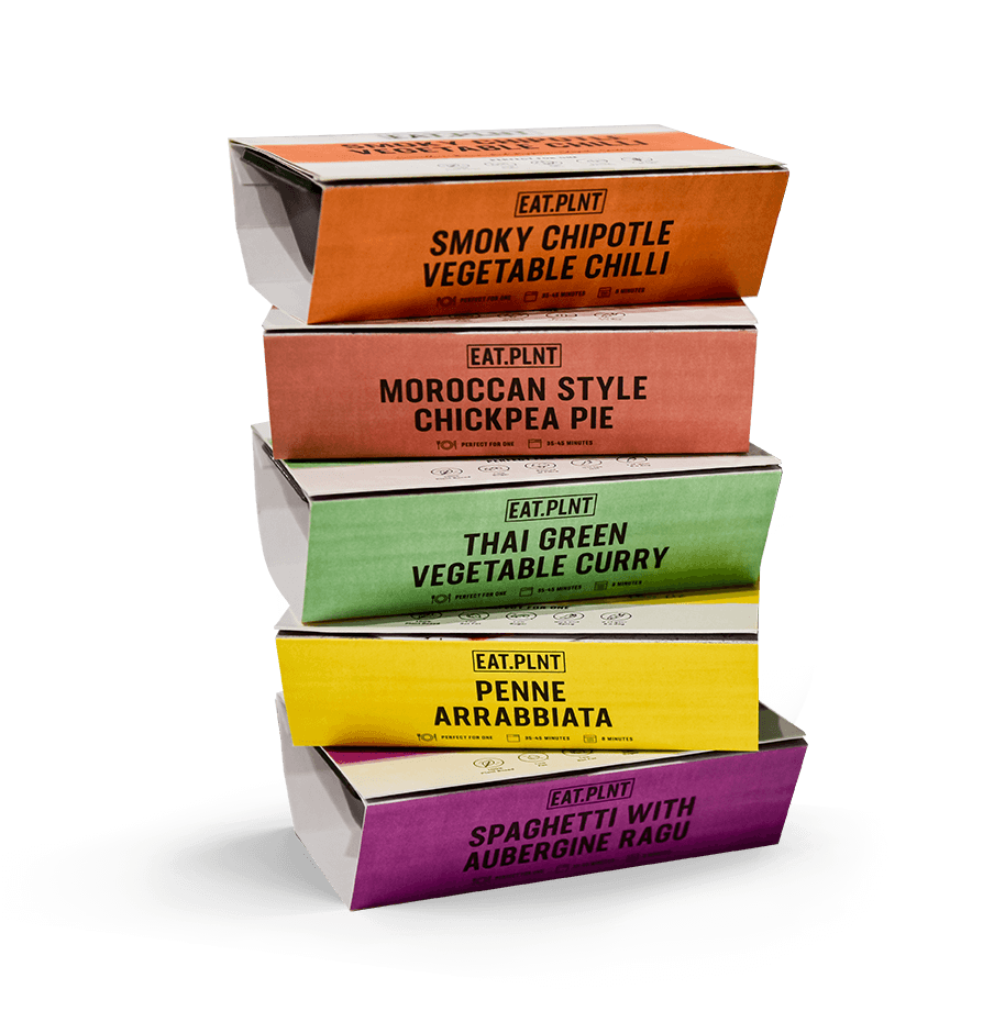
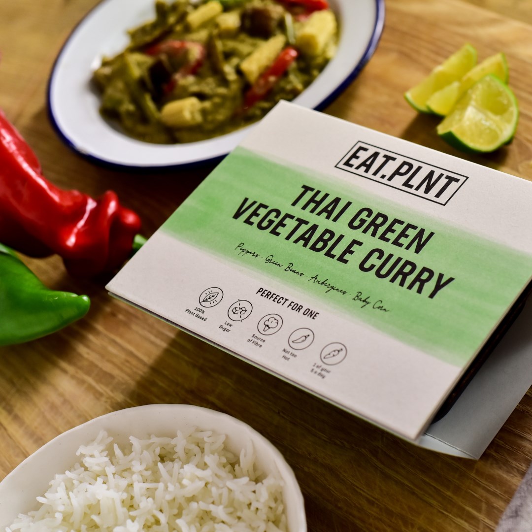
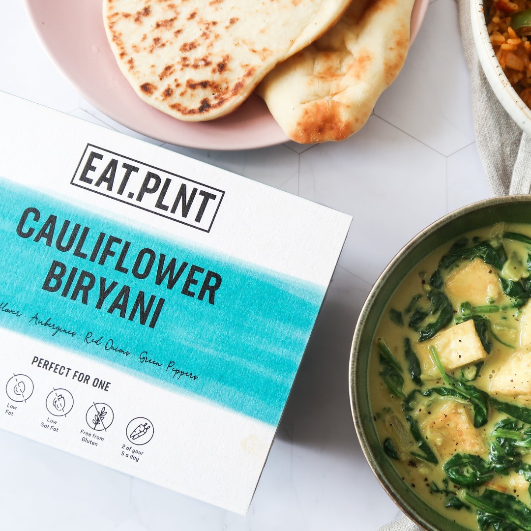
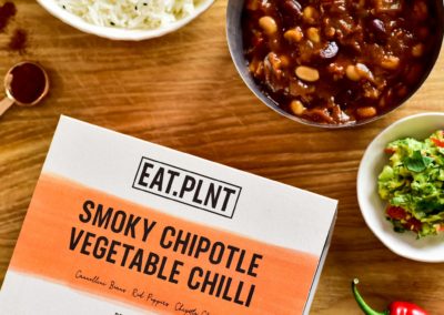
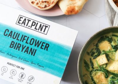
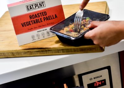
EAT.PLNT has developed a signature style of packaging which is contemporary, bright and easily recognisable.
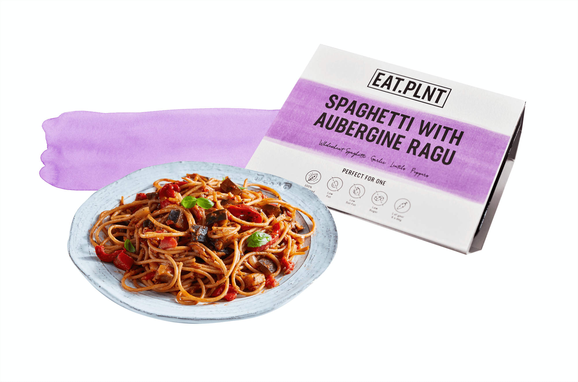
The bright block colour on the sides of the sleeve and running in a broad, bold stripe across the front are visually striking for the customer, and differentiate easily between the different meals, allowing regular customers to recognise their favourites at a glance.
The clean lines of the black sans serif font, logo and icons on white create an uncomplicated, modern sleeve to appeal to our target audience and create immediate clarity about our products. A touch of the personal is created with the secondary font in a handwriting style, in keeping with our warm and supportive relationship with our customers.
THE RANGE
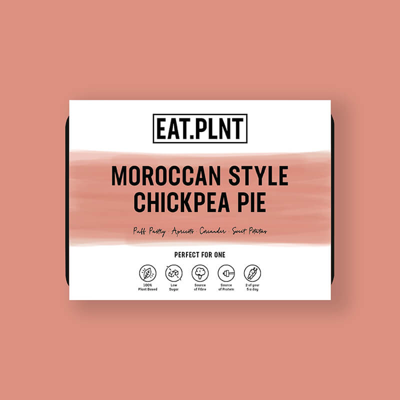

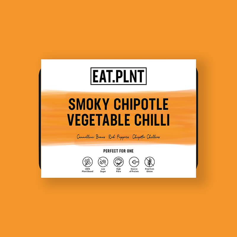
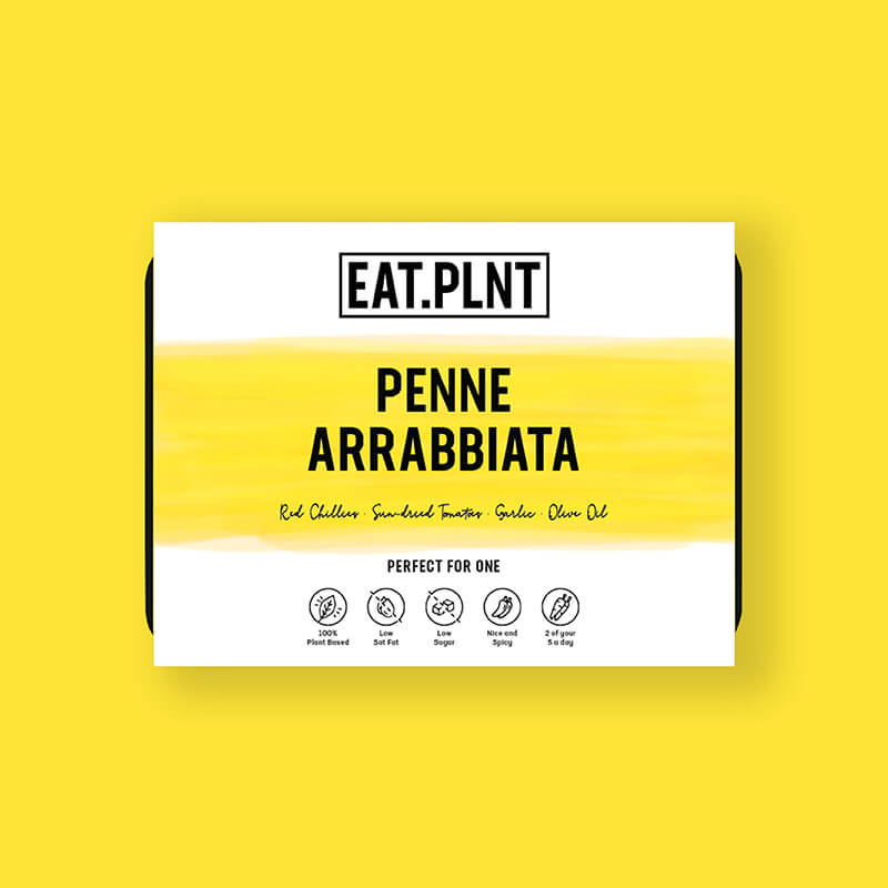
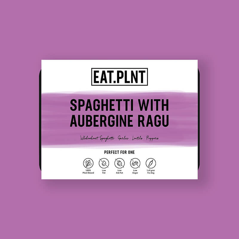
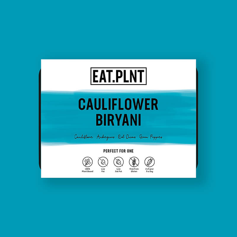
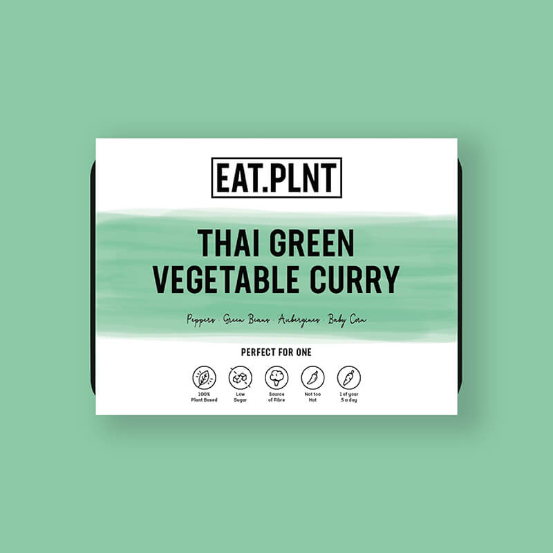
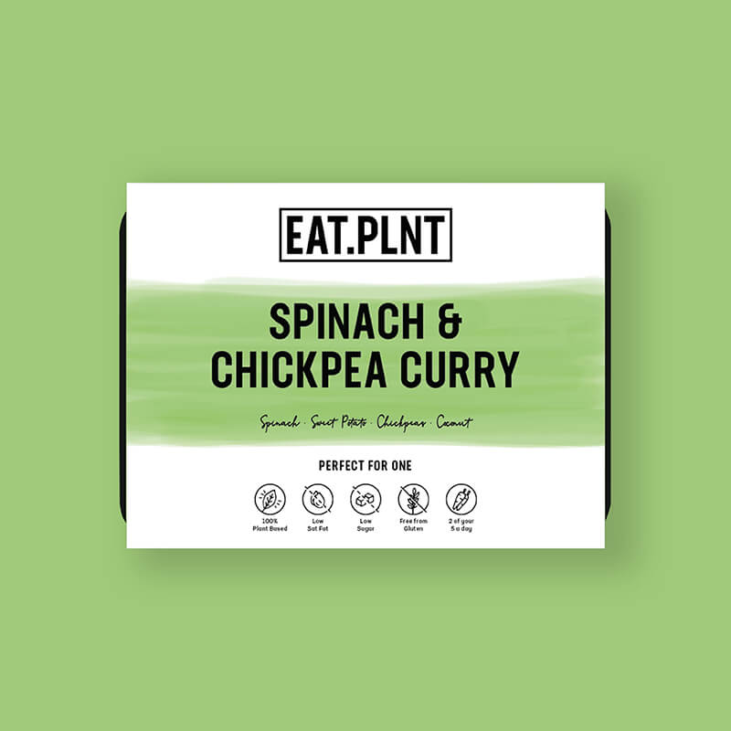
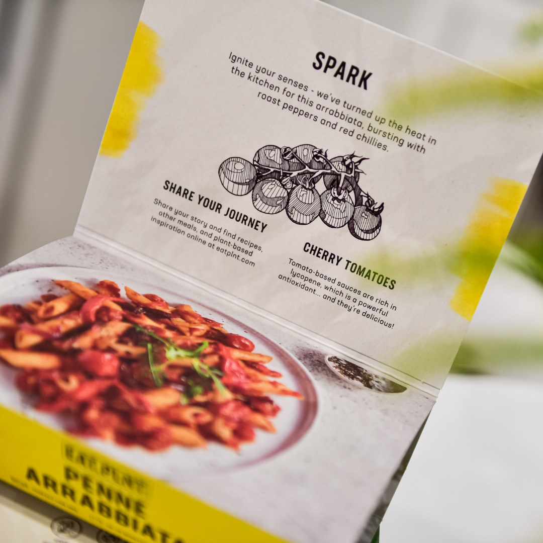
The sleeve includes a ‘lid’ which, inside, gives further product information and a full-colour photograph of a serving suggestion for the individual meal.

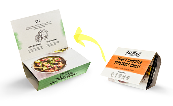
The sleeve includes a ‘lid’ which, inside, gives further product information and a full-colour photograph of a serving suggestion for the individual meal.


