Stepping into new markets with Branding
Branding & Identity
OVERVIEW
EAT.PLNT was launched in 2019 by a small group of food enthusiasts determined to make plant-based eating easy, healthy and delicious for everyone. When we first met this team, Eat.Plnt was still just an idea that needed to materialize into a well-defined and captivating brand. Through the identity of the brand, it was necessary to communicate the essence of these products: tasty, nutritious meals delivered straight to the client’s door, so cooking a conscience- and tummy-satisfying meal is a cinch.
EAT.PLNT has both B2B and B2B audiences and they aim high in both. The B2B target market is epitomised by Holland & Barratt: big high-street names with a health-food focus, alongside smaller convenience stores and farm shops. EAT.PLNT aims to be a household name when it comes to high quality plant-based food. The customers we are targeting include committed vegans, but also those who are dipping a tentative fork into plant-based eating. EAT.PLNT’s ideal audience is likely to be under 45, well-informed about health, and with a social conscience.
DELIVERABLES
Brand Positioning
Brand Naming
Logo Design
Colour Pallet
Typography
Bespoke Website Design
Brand identity
Brand Style Guide
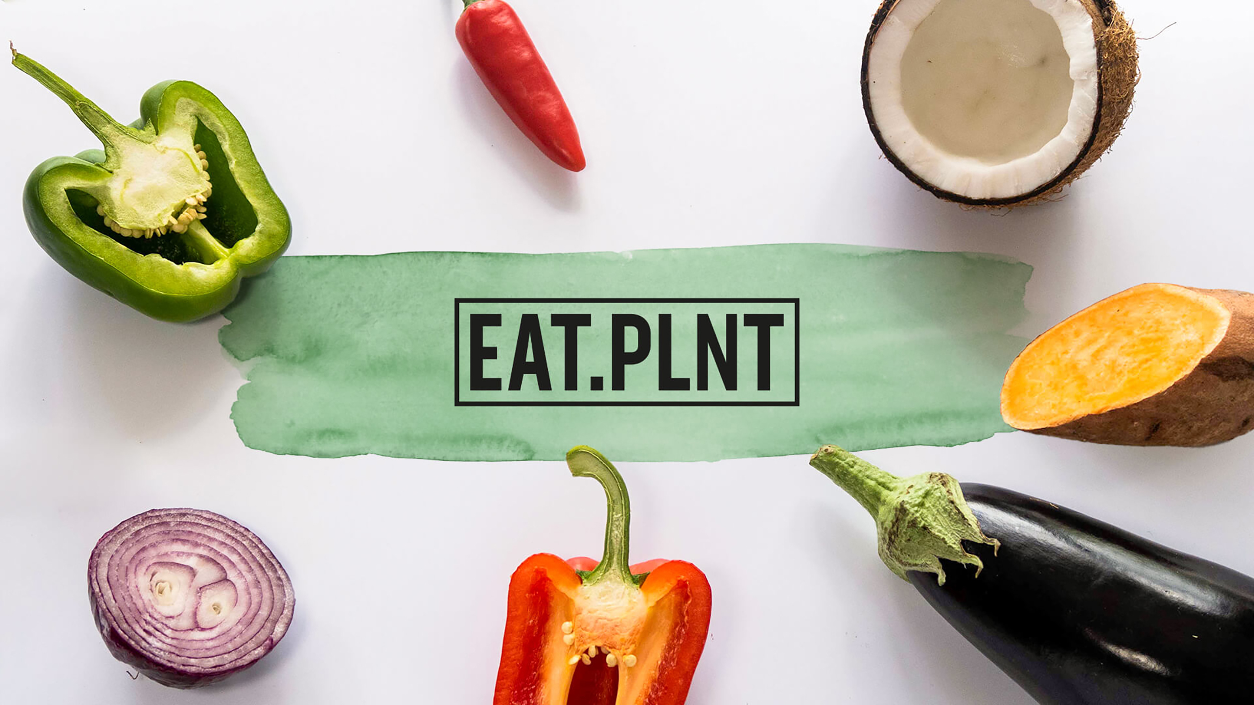
EAT.PLNT maintains a clean, modern design with simple yet effective elements to match its branding as a contemporary company that promotes healthy lifestyles and clean eating.
The logo is easily memorable and immediately hints at the world of plant-based healthy food.
In order to establish a relationship of mutual respect with the buyer, the brand needs to persuade him of its goodness. It must therefore be able to communicate with him by attracting his attention. Colour is an essential tool to be able to get noticed and therefore know and recognize. As well as the services that are intangible and immaterial entities, the colour of your brand becomes a distinctive element.
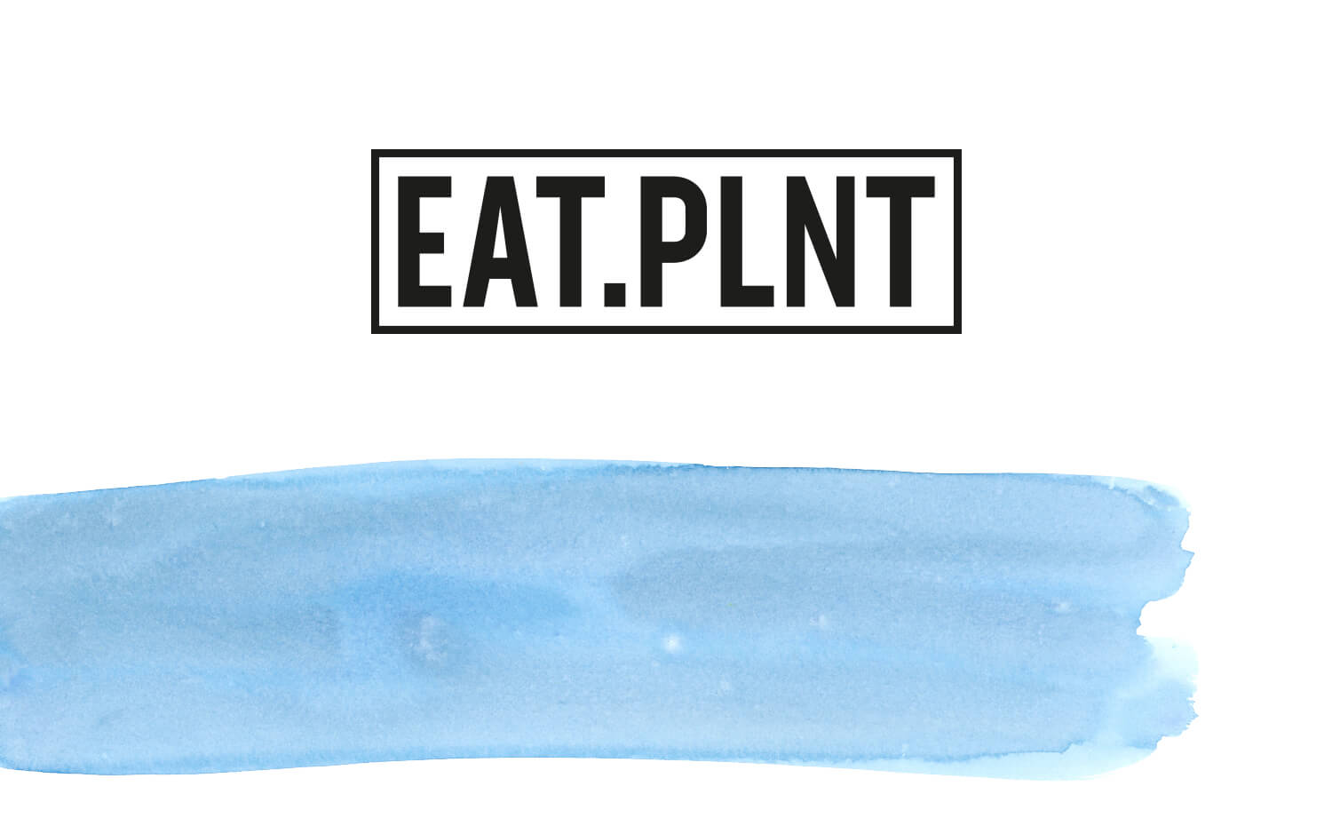
For EAT.PLNT we have chosen a palette of pastel tones that communicate tranquillity and comfort. Being not too saturated communicates the idea of genuineness.
The key graphic elements for EAT.PLNT are brushstrokes in the style and pastel colours of watercolour paint.
These are fundamental to brand identity and be used in all branding materials. Each dish is defined by an individually coloured brushstroke.
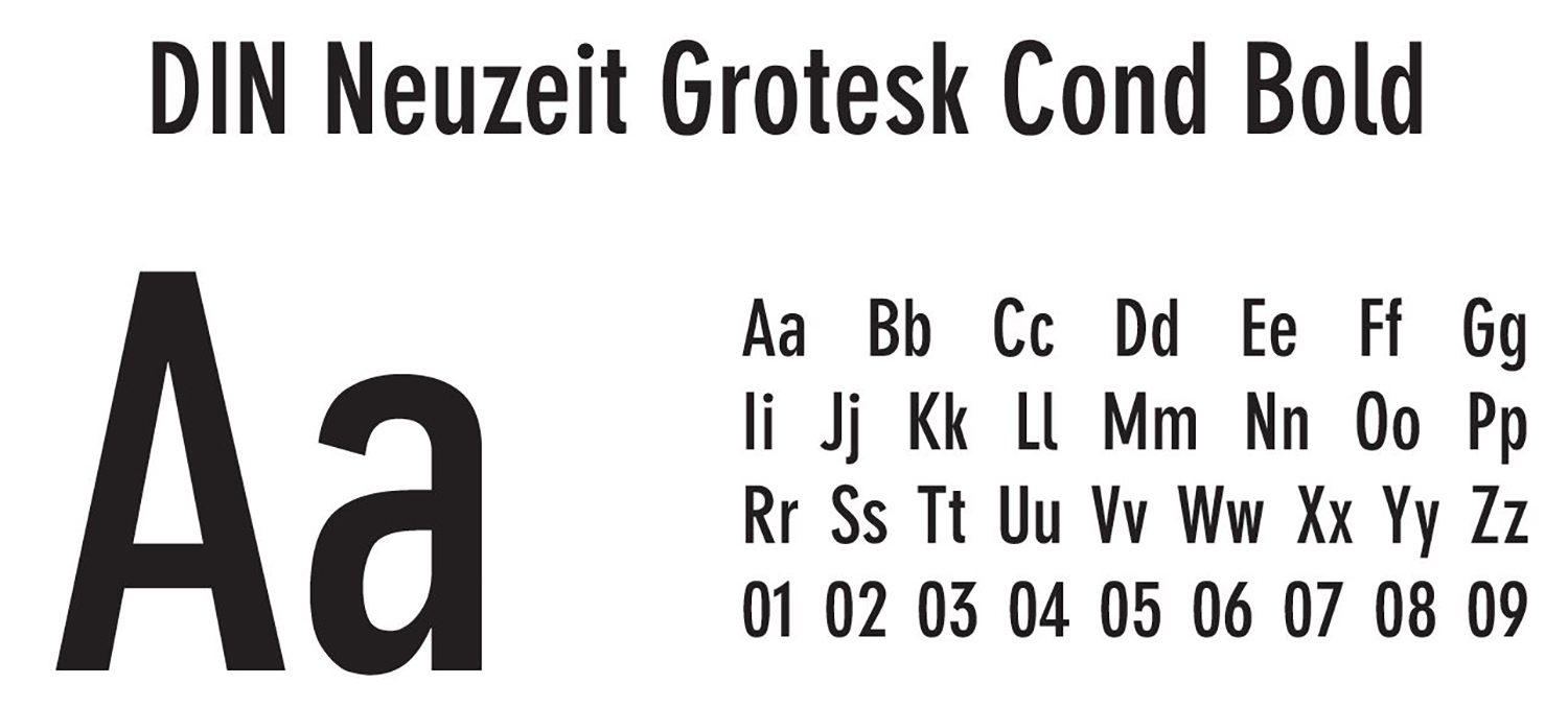
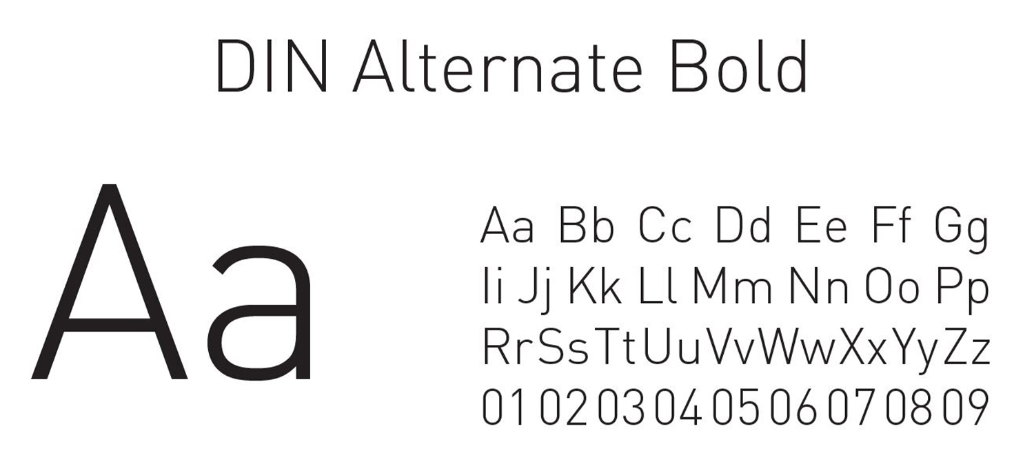
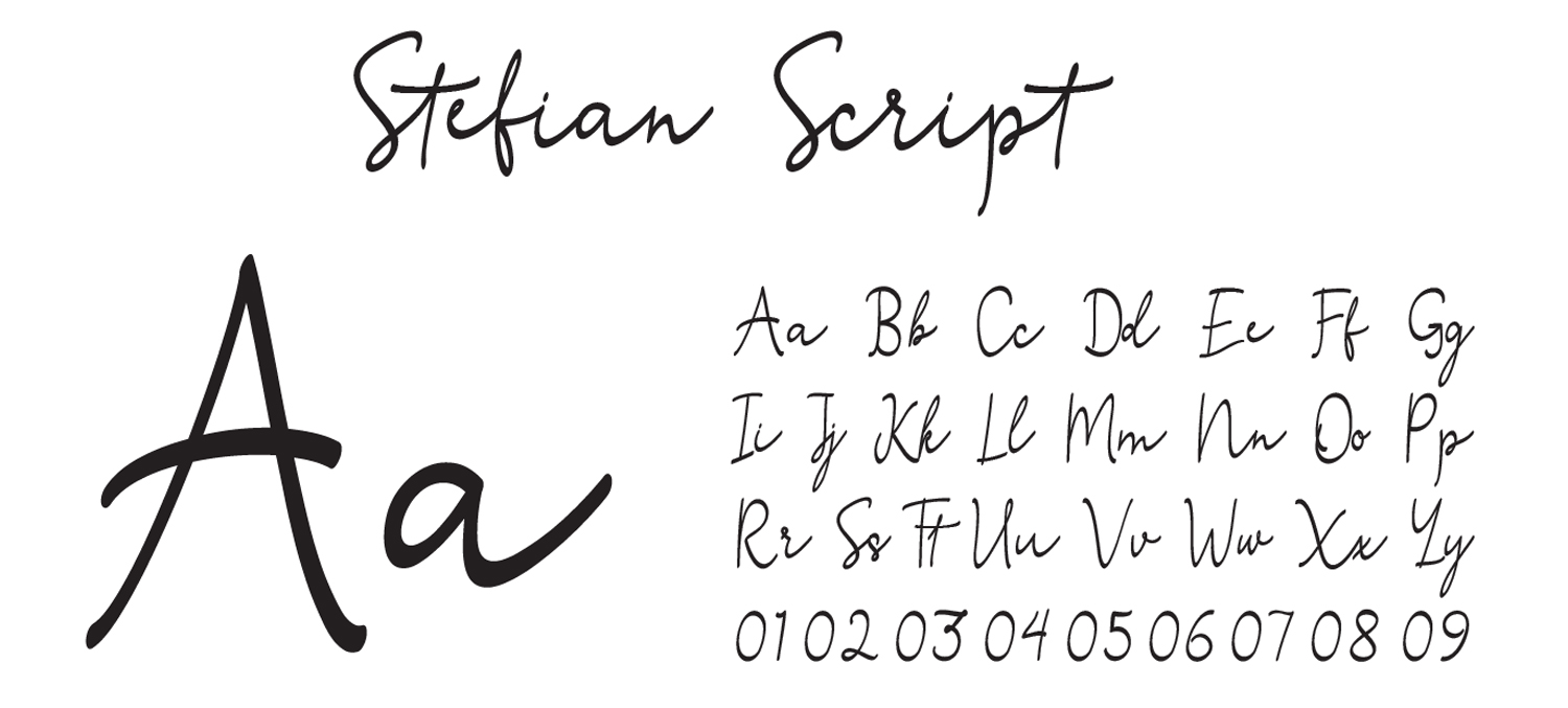
Even the choice of typeface to match a brand can never be random. It is always necessary to have an idea of how to identify the writing font that a brand must adopt in its communication. For EAT.PLNT we have chosen a condensed font that works very well in digital and, unlike the serif fonts, is inclusive, easily understood by, and unintimidating to, the average shopper.
COLOR PALETTE

TYPOGRAPHY
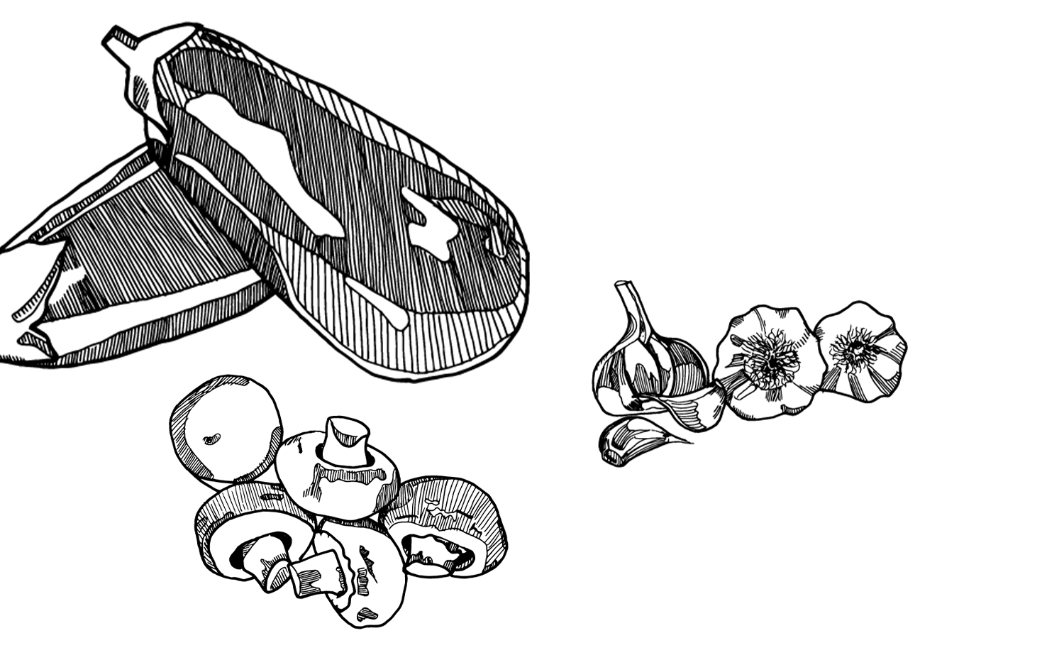

To accompany the brand we have selected hand-made illustrations, which also clearly communicate a sense of genuineness and simplicity that helps to remove the idea of industrial production that is not suited to the vegan lifestyle.
EAT.PLNT at the end of the branding work appears as a well-defined brand, with a strong personality. It communicates genuineness, inclusiveness and easiness. Through instant visual communication it manages to reach his target with immediacy and clarity.
BRANDING & DESIGN EXPLORATION
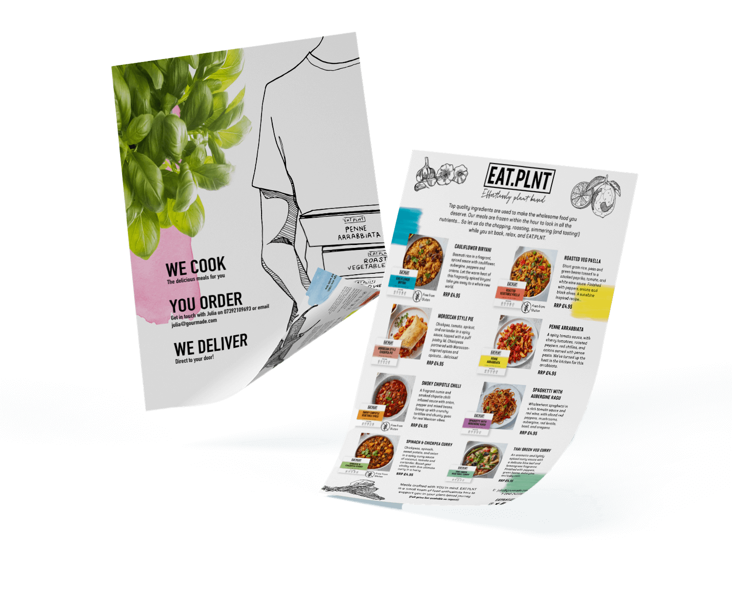
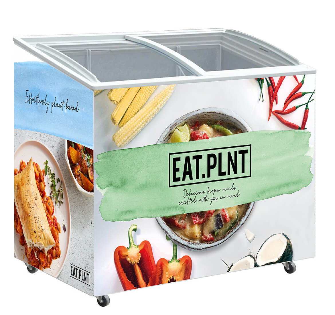
Eat.Plnt’s brand identity is well suited to both digital and print. It is a clean and lively style that attracts the attention of the potential client. It also works successfully in B2B. Below is an example of a branded fridge for stockists.
